Bottle Lettering Symbols
Various symbols are used on this site to describe how the lettering appears on the bottles. Generally, the methodology that is used to describe the format of the lettering or lack thereof on this site follows the model set by Carlyn Ring in her book For Bitters Only published in 1980. The following symbols and examples of their use are illustrative of those used on this site:
| Symbol | Description | Sample Use | Sample |
| / | Indicates the end of the description on this line of the bottle. Any lettering that follows is on a new line on the same side of the bottle. | CH. HAEBERLE / PHILADELPHIA | 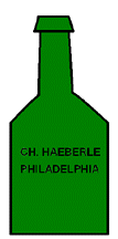 |
| // | Indicates the end of the description on this side of the bottle. Lettering that follows is on a new side. | CH. HAEBERLE / PHILADELPHIA // H // | 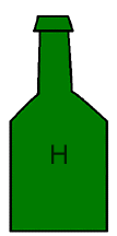 |
| // b // | Indicates the information that follows is on the base of the bottle. | // b // 252 / H | 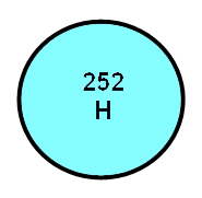 |
| // c // | Indicates that this side of the bottle has no lettering or pictures and is curved. | H. POWELL // c // | |
| // f // | Indicates that this side of the bottle has no lettering or pictures and is flat. | RIDDLE'S // f // PHILAD.A // f // MINERAL // f // WATERS. // f // | |
| // l // | Indicates the information that follows is on the lip of the bottle. | // l // TRIPP & LUSCOMB // c // |  |
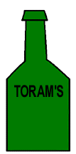
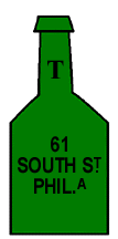
| // n // | Indicates the information that follows is on the neck of the bottle. | // n // T // c // TORAM'S // 61 / SOUTH ST / PHIL.A // |
  |
| // s // | Indicates the information that follows is on the shoulder of the bottle. | // s // J. SALBER // c // | 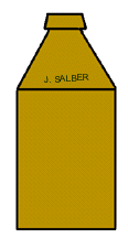 |
| // sp // | Indicates that this side of the bottle has no lettering or pictures and has a sunken panel. | HIRES // ROOT BEER // PHILA. // sp // | |
| ( |
The lettering arches or is curved upwards. | ( |
 |
| ( |
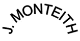
The lettering arches or is curved downward. | McCAULEY / ( |
 |
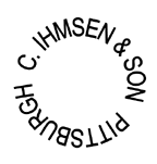
| (o) | The lettering is in a continuous circle. Usually on the base of the bottle. | (o) C. IHMSEN & SON PITTSBURGH |
 |
| (/) | The lettering slants upwards. | (/) Continental / (/) Brewing Company) / (/) Philada. (all in script) // | 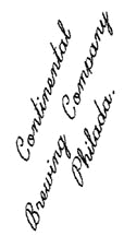 |
| (\) | The lettering slants downward. | (\) DAVISON \ (\) & THEM // | 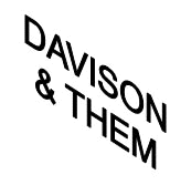 |
| (>) | The lettering shrinks from larger to small as it goes from right to left. | (>) TRADE |  |
| (<) | The lettering expands from smaller to larger as it goes from right to left. | (<) MARK |  |
| (<>) | The lettering starts out small, gets larger and then smaller as it goes from left to right. | (<>) TRADE MARK |  |
| (><) | The lettering starts out large, then gets smaller then expands larger. | (><) TRADE MARK |  |
| (|) | The lettering is vertical. | (|) TRADE MARK |